Use a splash page when one action matters more than everything else. That action may be joining a waitlist, registering for an event, downloading a guide, or claiming a launch offer. The benchmark is simple: WordStream has reported an average landing page conversion rate of 2.35%, while the top 25% reached 5.31% or higher [source: WordStream]. A focused splash page gives you a better chance of moving visitors toward that single goal.
TLDR: A strong splash page is short, visual, and built around one clear call to action. For example, a SaaS product launch page with 10,000 visitors and a 5% signup rate would add 500 people to a waitlist before release. Use splash pages for product launches, lead capture, events, seasonal campaigns, app previews, and gated offers. Keep the page fast, remove clutter, and make the next step obvious.
1. Product launch splash page
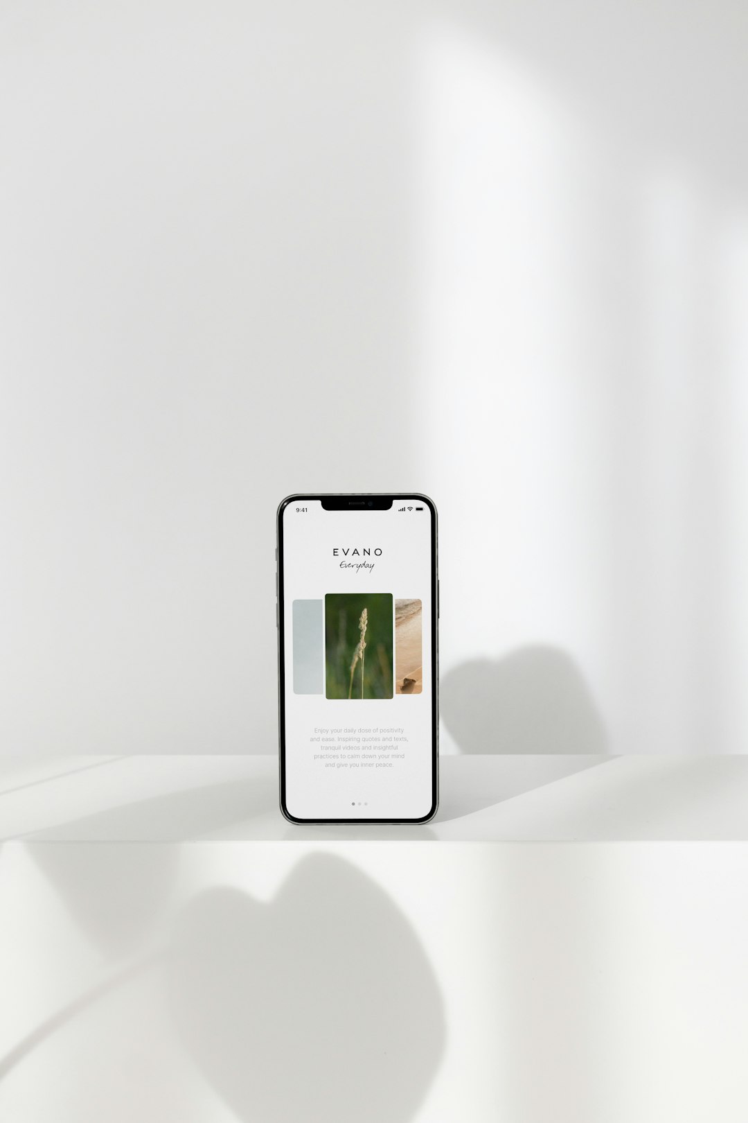
A product launch page should create confidence fast. Visitors need to know what is coming, who it is for, and why they should care. The best design uses a bold headline, a product visual, three short benefits, and one signup form.
Best for: SaaS tools, apps, ecommerce products, creator platforms, and hardware launches.
- Headline: Explain the product in plain words.
- Visual: Show a clean mockup or product shot.
- CTA: Use “Join the waitlist” or “Get early access.”
- Proof: Add founder names, beta user quotes, or investor mentions if real.
Honestly, it feels like many launch pages try too hard. They hide the product behind vague taglines. Do not say “The future of productivity.” Say “Plan team projects in one shared calendar.”
2. Lead capture splash page
A lead capture page has one job: collect a useful contact. That may be an email address, phone number, company name, or job role. The offer must be clear enough to earn the form submission.
Example: A B2B finance firm offers a free checklist called “12 Questions to Ask Before Switching Payroll Software.” The page includes a short problem statement, a preview of the checklist, and a form with three fields.
Do not ask for ten fields if the reward is small. It drives me crazy when a basic PDF requires a full address, budget range, and company size. People leave. Keep the form fair.
- Use a strong lead magnet.
- Show what the visitor gets.
- Keep fields to the minimum needed.
- Add a privacy note near the button.
3. Event registration splash page
An event splash page must answer the practical questions first. What is it? When is it? Where is it? Who should attend? If those answers are hard to find, the design has failed.
Best layout: headline, date, speaker image, value statement, agenda bullets, registration button. If seats are limited, say so only when it is true. False urgency damages trust.
For webinars, add the time zone near the date. For in-person events, add the venue and city above the fold. Expect to waste time on support emails if that information is buried near the footer.

4. Campaign splash page
Campaign pages work well for short-term promotions. This includes holiday sales, nonprofit drives, political campaigns, product bundles, and awareness efforts. The page should match the campaign message exactly.
If an ad says “30% off winter running gear,” the splash page should repeat that offer. Do not send visitors to a generic homepage. That breaks the scent trail and weakens intent.
- Hero section: State the offer.
- Timer: Use only for real deadlines.
- CTA: Match the ad copy.
- Trust elements: Add reviews, secure payment icons, or return terms.
5. App preview splash page
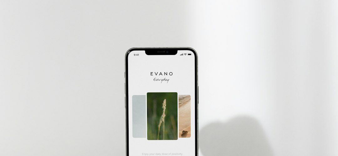
An app preview page should show the product quickly. Use screenshots, a short video, or a simple animation. The copy should focus on one use case, not every feature.
Example: A fitness app might lead with “Build a 20-minute workout plan in under one minute.” That is clearer than listing “AI plans, tracking, reminders, and social sharing” with no context.
Place the App Store and Google Play buttons high on the page if the app is live. If it is not live yet, use a waitlist form. Add device mockups, but keep file sizes low. Slow splash pages lose people before the pitch even starts.
6. Gated offer splash page
A gated offer page asks visitors to trade contact details for access. This can work well for research reports, templates, calculators, trials, and private demos. The key is perceived value.
A serious design helps here. Use a plain headline, a short summary, a preview image, and clear terms. If the offer is a report, name the number of pages. If it is a template, show a cropped preview. If it is a trial, state what is included.
What the best splash pages have in common
- One goal: No competing menus, banners, or mixed CTAs.
- Fast loading: Compress images and cut heavy scripts.
- Plain copy: Say what the visitor gets.
- Visible CTA: Put the main button near the top.
- Proof: Use real reviews, numbers, clients, or credentials.
- Mobile care: Forms and buttons must work on small screens.
A splash page is not a smaller homepage. It is a controlled entry point. Treat it like a focused sales conversation. Remove anything that does not support the goal, then test the headline, form length, visual, and button text. Small changes can matter when traffic is paid, seasonal, or tied to a launch date.